Logo Design: Trendy or Timeless?
Your Logo Should Be Timeless…Or should it?
One of the caveats of logo design is that it should be timeless, to last forever and ever, never to change. You want a logo that will establish your brand, and help people identify your company over many years…but SHOULD your logo never change? And how do you know when you should switch it up?

The Tiffany & Co logo. It's never changed since it was first designed in 1847.

The Tag Heuer logo. Only three versions were created throughout the years, and the main shape has has stayed the same.
These are two logos have very different styles, but both these logos have hardly changed in about 170 years. Talk about longevity! It’s what every business dreams of, right? A long lasting, never changing logo and brand (not the same thing), that are recognized the world over.
But does that mean your logo should look like this?
Absolutely not.
“No design works unless it embodies ideas that are held common by the people for whom the object is intended.”
Adrian Forty
Examples of trendy logo design
Below are examples of current logo styles that are very trendy. They’ve been popular for several years, but I’m sure in a decade they’re going to look “so 2020s.”
LUNA: Fine line art with simple sans-serif font
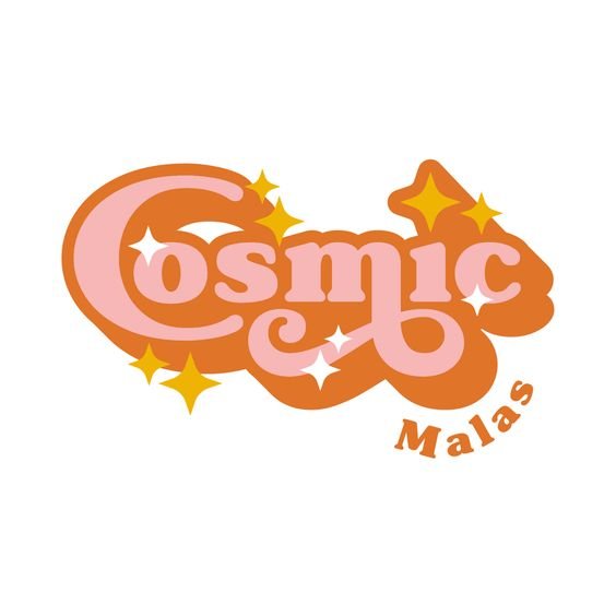
COSMIC: updated retro bubble style
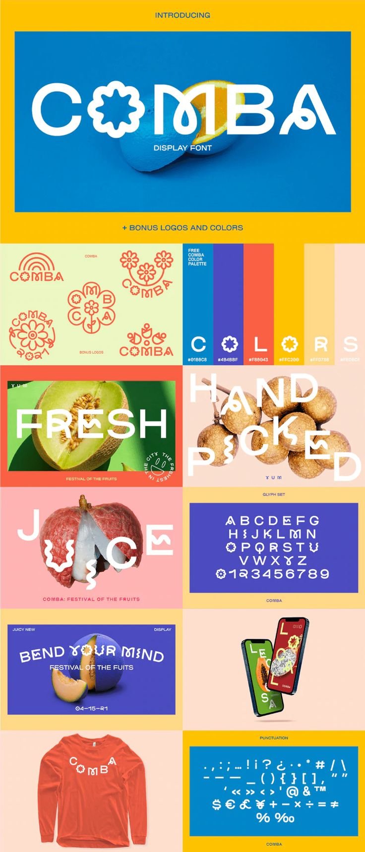
COMBA: Mismatched quirky fonts with illustrated letters
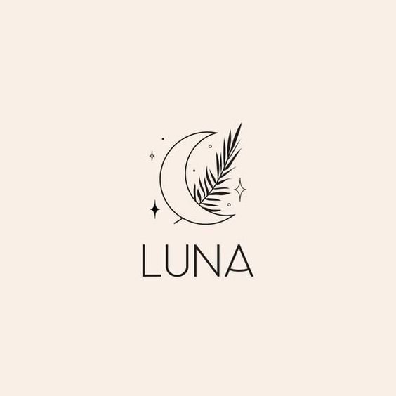
Current trend in logo design: Line art with a sans serif font. This style has been popular for a few years.
So how do you know which style to use?
Timeless
You have to take into account who your ideal clients are, what your business or product is about, as well as what your mission and values are. If you’re trying to market a product to tweens, the branding is going to look very different than if you’re marketing to women over 40 making $100K+.
A timeless logo will rely on visual cues from the past, especially high-end brands. Dare I say they look is a bit more boring than a more trendy logo ? (sorry not sorry) Colors are more muted, usually just a black font.
There shouldn’t be anything super exciting about a timeless design, and it shouldn’t look like it’s from a specific time period either. It could be from any decade, that’s why it’s considered timeless :)
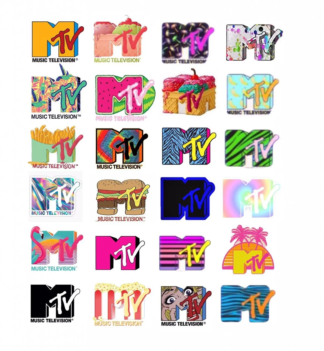
I want my MTV…to change and appeal to a variety of audience members.
Trendy
A trendy design has more freedom in exploring fonts and mixing them with illustrations. It could mix hand-drawn letters or icons with bold fonts, and brighter color palettes. It will definitely feel like it’s from a certain time period.
For example: The MTV logo! It has gone through more color schemes, pattern changes and effects than any other logo in recent memory. Is it recognizable: Yes. Timeless? I’m not so sure. Because it has to appeal to a younger audience, it has to be able to adapt for various shows, media, and trends.
So, is your logo a Tiffany or MTV?